An interior designer’s guide to creating a gallery wall that’s collected, personal, and perfectly imperfect.
Gallery walls are one of my favorite ways to add personality, dimension, and visual interest to a space. Whether I’m designing a client’s home, staging a property for sale, or decorating my own house, a thoughtfully arranged gallery wall can completely transform an otherwise ordinary space.
And here’s the thing: A great gallery wall doesn’t require matching frames, expensive artwork, or a perfectly symmetrical layout.
It just needs a little balance, some creativity, and a willingness to think beyond the traditional framed print.
I’ve created gallery walls in everything from occupied homes to vacant staging projects, and recently tackled one in my own home. Each installation is different, but the design principles are pretty much the same.
Here are some of my favorite tips for creating a gallery wall that feels intentional, interesting, and uniquely suited to the space.
1. Start With a Story (Even If It’s Not Yours)
The most interesting gallery walls have personality.
In a home you’re living in, that might mean family photographs, artwork collected while traveling, vintage finds, or sentimental objects you’ve held onto for years.
In a staged home, the approach is a little different. I’m not telling the homeowner’s personal story. I’m creating an atmosphere that helps potential buyers imagine their own lives unfolding there.
That might mean a collection of vintage-inspired artwork, architectural prints, or smaller pieces that complement the home’s style.
The goal is the same: Create something that feels collected rather than purchased as a matching set.
In my own home, I recently incorporated family photographs, a seashell we found on a beach in Mexico, and one of my husband’s mounted fish.
Yes, a fish. But not just any fish.
It’s a roosterfish Vince caught at Rancho Leonero in Baja California when he was a teenager, on a fishing trip with his dad.
Decades later, that same location became the setting for our wedding celebration in 2021. We’d already secretly gotten legally married, but that’s another story.
So that fish isn’t just fishing memorabilia. It’s a piece of family history that connects generations and memories.
And that’s exactly what makes a gallery wall interesting.
Designer Tip: Look beyond traditional artwork. Found objects from vacations, small souvenirs, handmade pieces, and meaningful treasures can all become part of a beautiful arrangement.
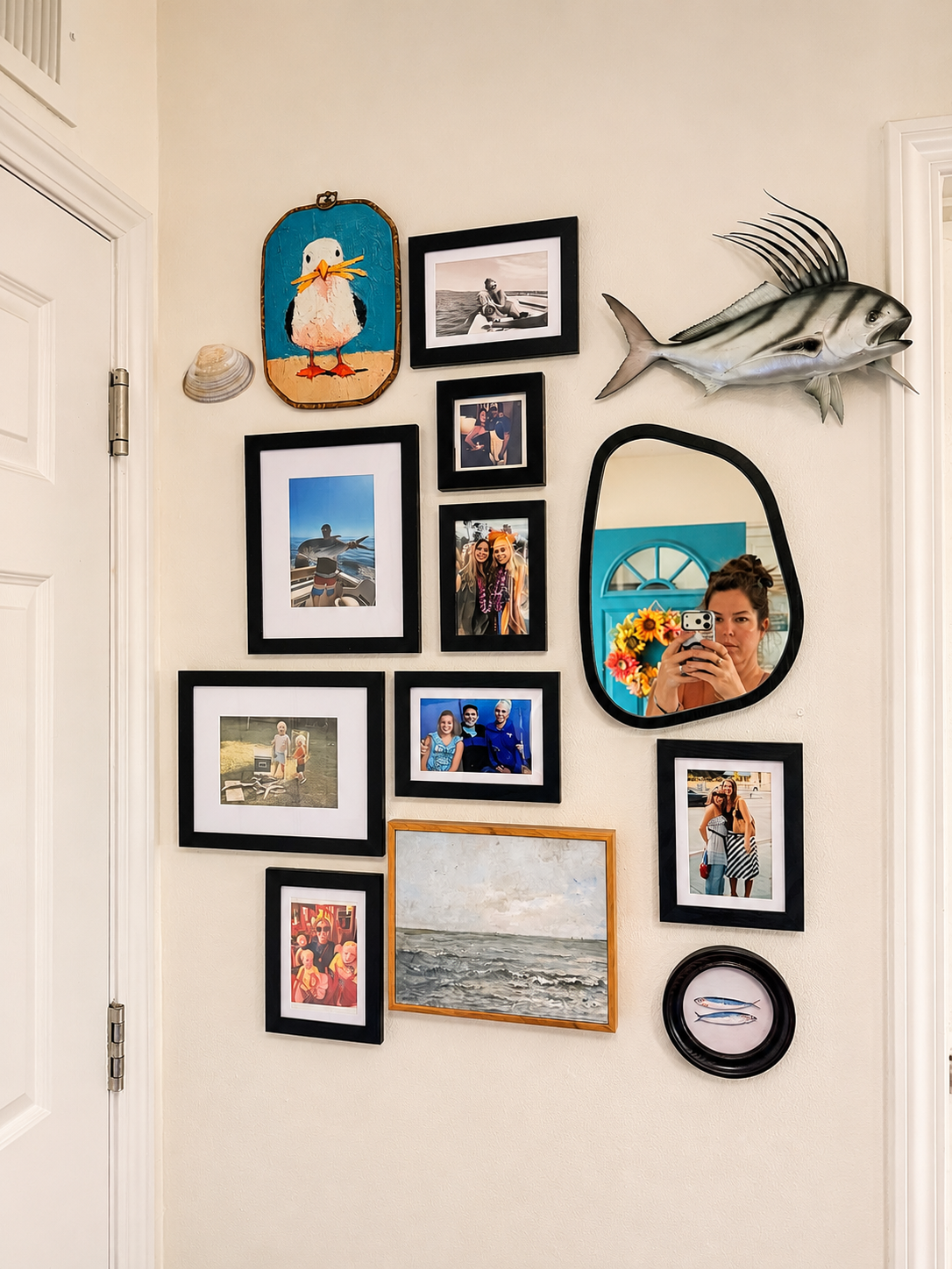
A gallery wall filled with family memories, travel treasures, and unexpected finds. Designed by Haus of Heidi in Oceanside, California.
2. Mix Your Frames, Shapes, and Textures
One of the biggest misconceptions about gallery walls is that everything needs to match. It doesn’t.
In fact, I usually prefer when it doesn’t.
Mixing frame sizes, finishes, shapes, and materials creates depth and keeps an arrangement from feeling too predictable.
In my own gallery wall, I combined black-framed family photographs with a wood-framed seascape, a colorful bird painting, a seashell, a dimensional roosterfish, and an organically shaped mirror.
That mirror is especially important to the composition. It breaks up the repetition of rectangular frames and adds another layer of visual interest.
I use this same principle in client homes and staging projects.
Sometimes I’ll mix black and natural wood frames. Other times, I’ll combine photography, abstract artwork, and vintage-inspired prints.
And occasionally, a mirror or dimensional object is exactly what the arrangement needs.
Designer Tip: If your gallery wall feels too rigid, introduce something round, oval, or irregularly shaped. Breaking up all those straight lines can make the entire arrangement feel more natural.
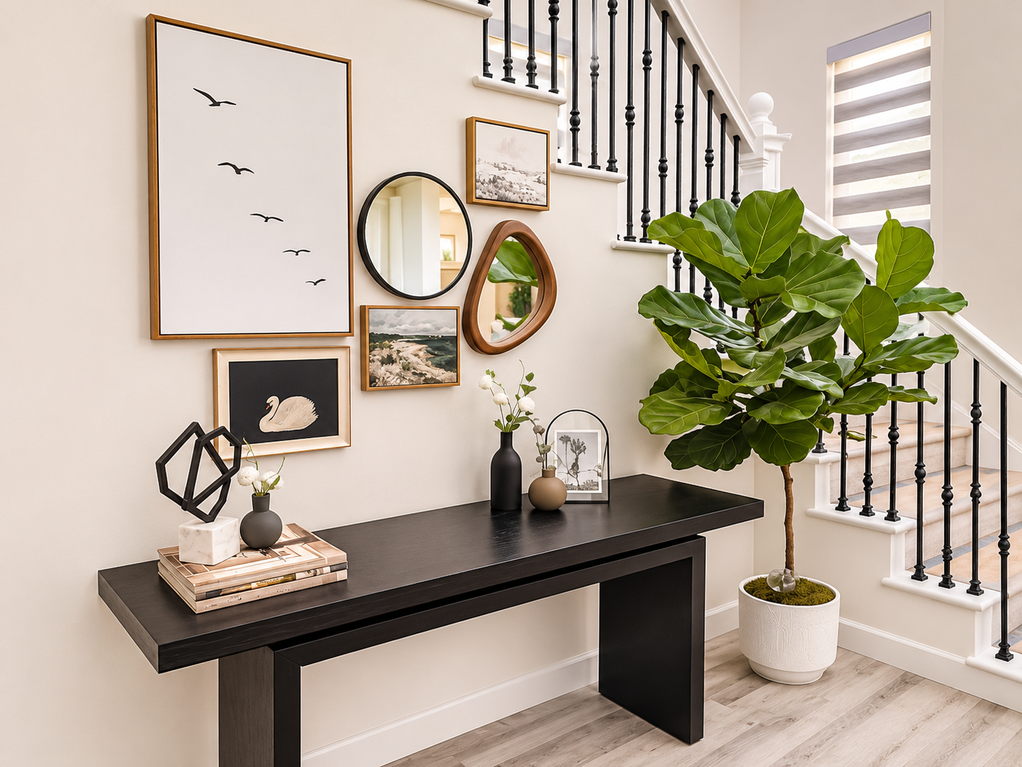
Who says gallery walls are just for living rooms? This Carmel Valley design project transforms an overlooked staircase wall into a focal point with layered coastal artwork, mixed frame finishes, and sculptural mirrors. Interior design by Haus of Heidi.
3. Plan Your Layout (Or Trust Your Instincts)
Here’s where I usually recommend a little preparation.
Before hanging anything, lay your artwork out on the floor and experiment with different arrangements. Start with your largest or most visually important piece and build around it.
Pay attention to visual weight. A large, dark frame on one side might be balanced by two or three smaller pieces on the other.
You can also trace your frames onto paper, tape the templates to the wall, and move them around before committing. It’s a great technique, especially if you’re creating your first gallery wall.
But here’s my confession.
When I recently installed the gallery wall in my own home, I completely winged it.
No paper templates. No carefully measured floor layout.
I had a general idea of the composition I wanted, started hanging, and adjusted as I went.
Would I recommend that approach to everyone? Probably not. But after nearly three decades in interior design, I’ve gotten pretty comfortable trusting my eye.
And sometimes the most interesting arrangements happen when you give yourself permission to experiment.
Watch My Gallery Wall Come Together
Here’s a little behind-the-scenes look at my installation:
4. Spacing Matters (But It Doesn’t Have to Be Perfect)
If you search for gallery wall instructions, you’ll find all sorts of rules about keeping everything exactly two or three inches apart. And while consistent spacing is a helpful starting point, it isn’t a requirement.
For a structured gallery wall, such as a grid of matching frames, precise measurements are important.
But for a more eclectic arrangement, I actually prefer a little variation. The goal is to create an overall composition that feels balanced, not to make every measurement identical.
Step back frequently and look at the entire wall.
Does your eye move comfortably around the arrangement? Does one area feel too heavy? Is there enough breathing room between the pieces? And remember, a gallery wall doesn’t have to form a perfect rectangle.
An organic arrangement can feel much more interesting, especially when you’re mixing artwork with objects of different shapes and sizes.
Designer Tip: Think of the entire gallery wall as one large piece of artwork. Its overall shape, scale, and relationship to the surrounding furniture matter just as much as the individual pieces.
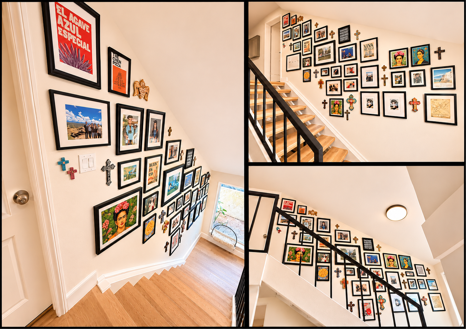
A staircase full of stories! This recent Haus of Heidi interior design installation in Carlsbad transforms a once-blank stairwell into a colorful, personal gallery of family memories, travel treasures, and Mexican-inspired artwork. Proof that even the most overlooked spaces deserve a little personality.
5. Get Creative With Placement
Gallery walls aren’t limited to the big empty wall above your sofa.
Some of my favorite installations happen in unexpected places.
A narrow hallway, a stairwell, an awkward wall between doorways, or a small area that doesn’t have room for one oversized piece of artwork can all be great candidates.
In staging, I especially love using collections of smaller artwork to give an otherwise overlooked space a purpose.
Not every wall needs a giant neutral canvas.
Sometimes a gallery wall creates far more interest, adds character, and helps a space feel thoughtfully designed.
The trick is choosing an arrangement that works with the architecture rather than fighting against it.
Designer Tip: Don’t overlook transitional spaces. Hallways, landings, and other pass-through areas are often perfect opportunities to incorporate artwork without overwhelming the main living spaces.
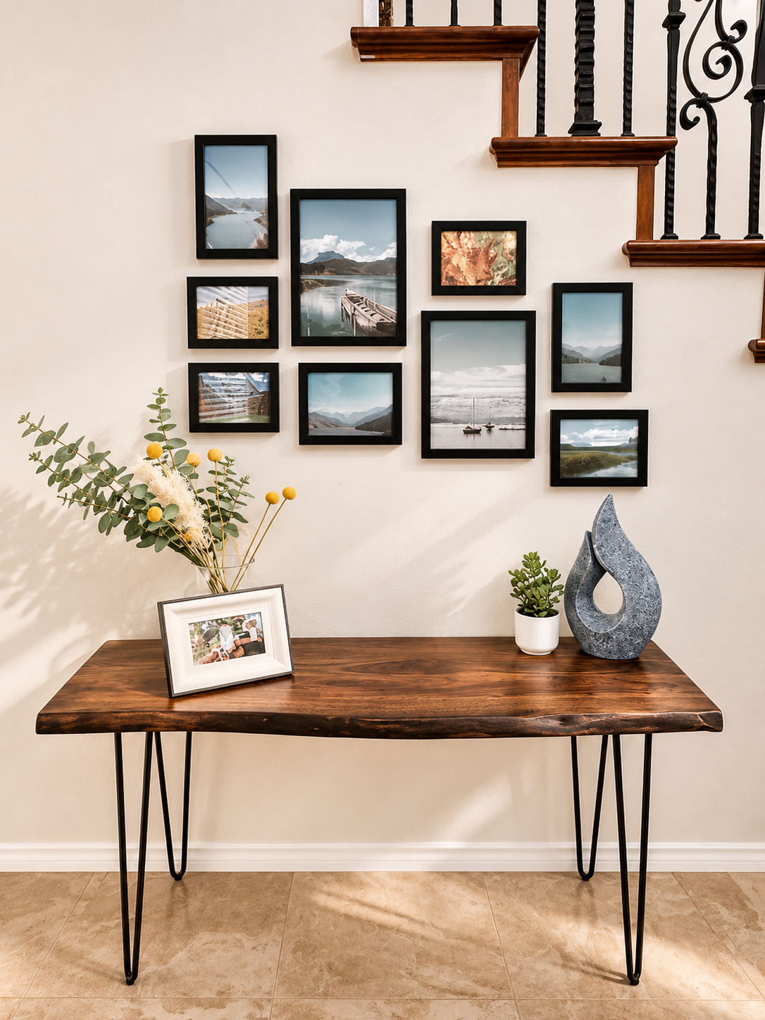
Small artwork, big impact! From a project in Carlsbad, here we have a collection of coastal landscapes transforms this overly decorative staircase wall into a beautiful focal point. Paired with a rustic wood console and thoughtfully styled accessories, it’s proof that gallery walls don’t need to be oversized or perfectly symmetrical to make a statement. Design by Haus of Heidi.
6. Use Removable Hanging Strips When Appropriate
Here’s one of my favorite tricks, especially for a gallery wall that might evolve over time.
Removable hook-and-loop hanging strips.
I used them for much of my personal gallery wall because I wanted the flexibility to change things around without constantly patching and repainting nail holes.
Maybe I’ll find another piece of artwork I love.
Maybe I’ll swap out a family photograph.
Maybe I’ll decide something needs to move three inches to the left.
No big deal.
Just make sure you’re using strips rated for the weight of each piece, following the manufacturer’s instructions, and attaching them to suitable surfaces. Heavier or irregular objects may need traditional hanging hardware.
And speaking of getting creative, I even incorporated a piece of artwork to disguise our thermostat.
Not exactly the prettiest feature in a room, but definitely a necessary one!
If you’re considering something similar, remember that thermostats need proper airflow and unobstructed sensors to read temperatures accurately. Keep controls accessible and follow the manufacturer’s guidance.
Designer Tip: Your gallery wall doesn’t have to be permanent. Choose hanging methods that make sense for your artwork, wall surface, and how frequently you might want to change the arrangement.
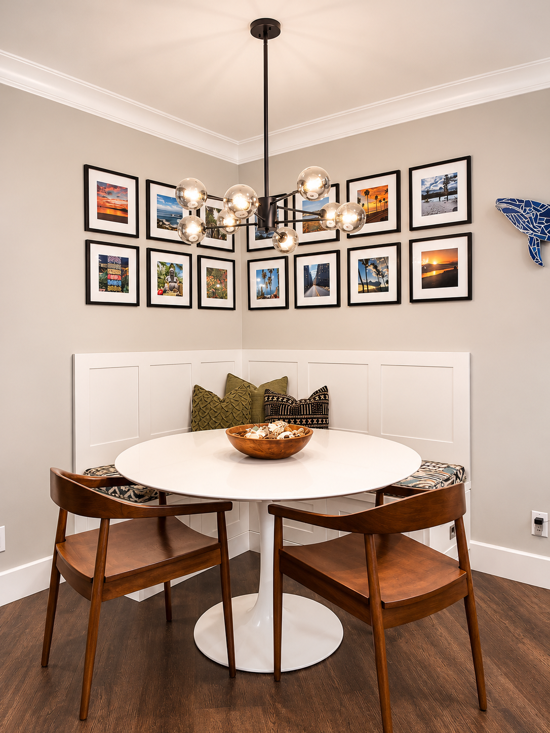
Who says a gallery wall has to stay on one wall? For this La Costa interior design project, we wrapped a collection of framed photographs around the corner of a cozy dining nook. The structured arrangement creates a continuous focal point, complements the custom banquette, and proves that gallery walls can be just as beautiful when they’re perfectly organized as when they’re eclectic. Interior design by Haus of Heidi.
7. Gallery Walls Have a Place in Home Staging, Too
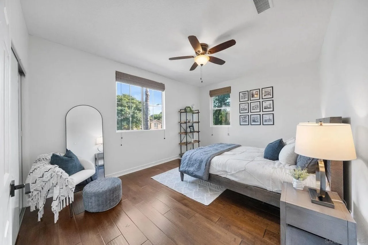
Sometimes symmetry is the perfect solution! For this Carlsbad home staging project, we created a structured gallery wall of nine coordinating black-framed prints above the bed. The arrangement adds visual interest without overwhelming the room, proving that gallery walls can be just as effective in a calm, inviting bedroom as they are in a busy hallway. Home staging by Haus of Heidi.
When people think of professionally staged homes, they often picture oversized neutral canvases, abstract artwork, and perfectly coordinated accessories.
And while those pieces certainly have their place, not every wall in a staged home needs a giant beige painting.
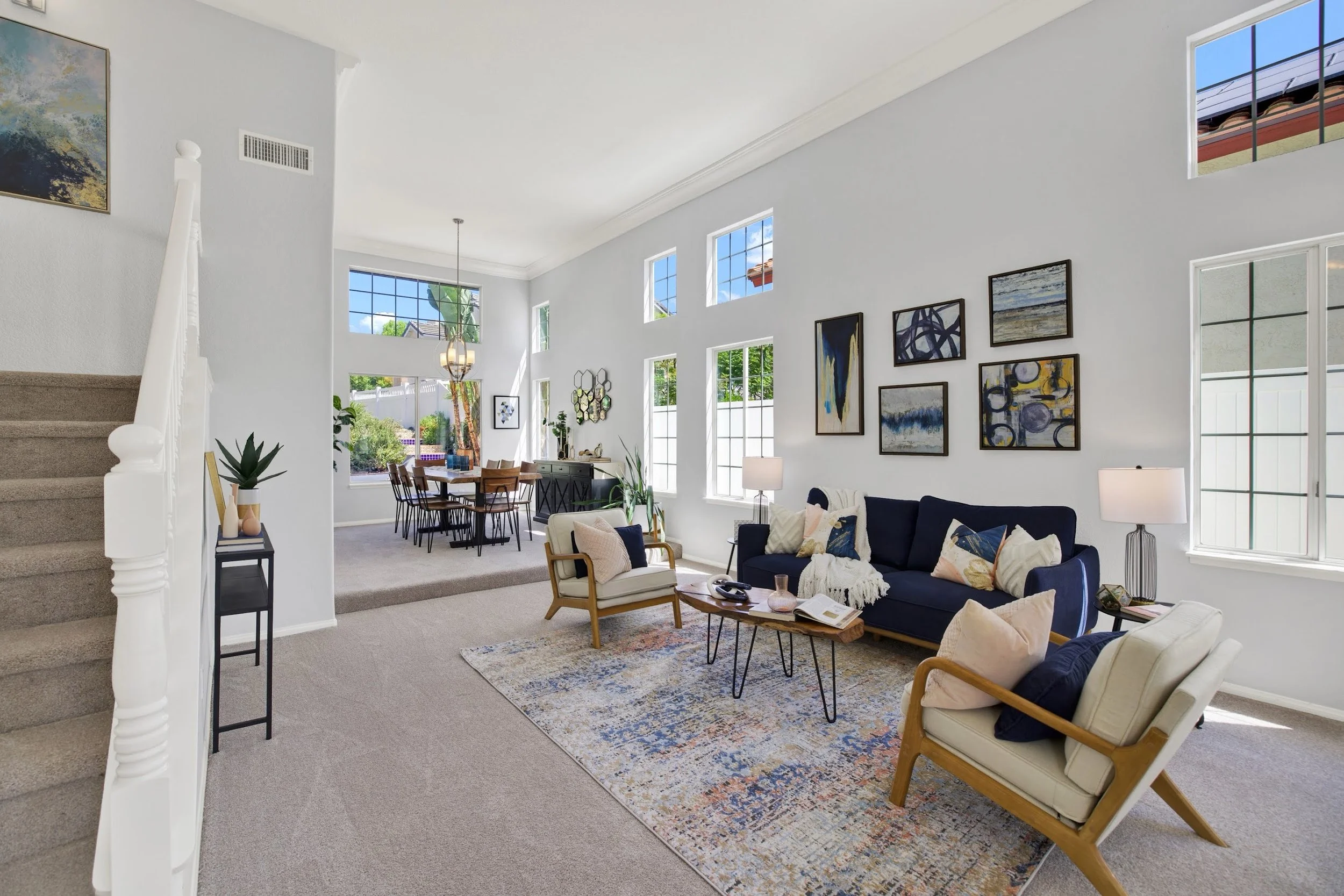
Gallery walls don’t always mean family photos! For this Rancho Bernardo home staging project, we created an eclectic arrangement of six abstract artworks above the sofa. The mix of sizes, colors, and orientations adds personality and visual interest while complementing the room’s soaring ceilings. Proof that thoughtfully curated artwork can make a big impact without relying on one oversized canvas. Home staging by Haus of Heidi.
I love incorporating gallery walls into my staging projects because they add personality, warmth, and visual interest.
A collection of smaller pieces can create a focal point, make an awkward wall feel intentional, or help define a space.
Of course, staging and decorating your own home are two different things.
In a staged property, I’m not displaying personal family photographs or sentimental collections. I’m selecting artwork that complements the home’s architecture, appeals to a broad audience, and helps potential buyers connect emotionally with the space.
But that doesn’t mean everything needs to be bland.
Thoughtful staging should feel inviting and aspirational, not generic.
Because even a house that’s for sale should feel like somewhere you’d actually want to live.
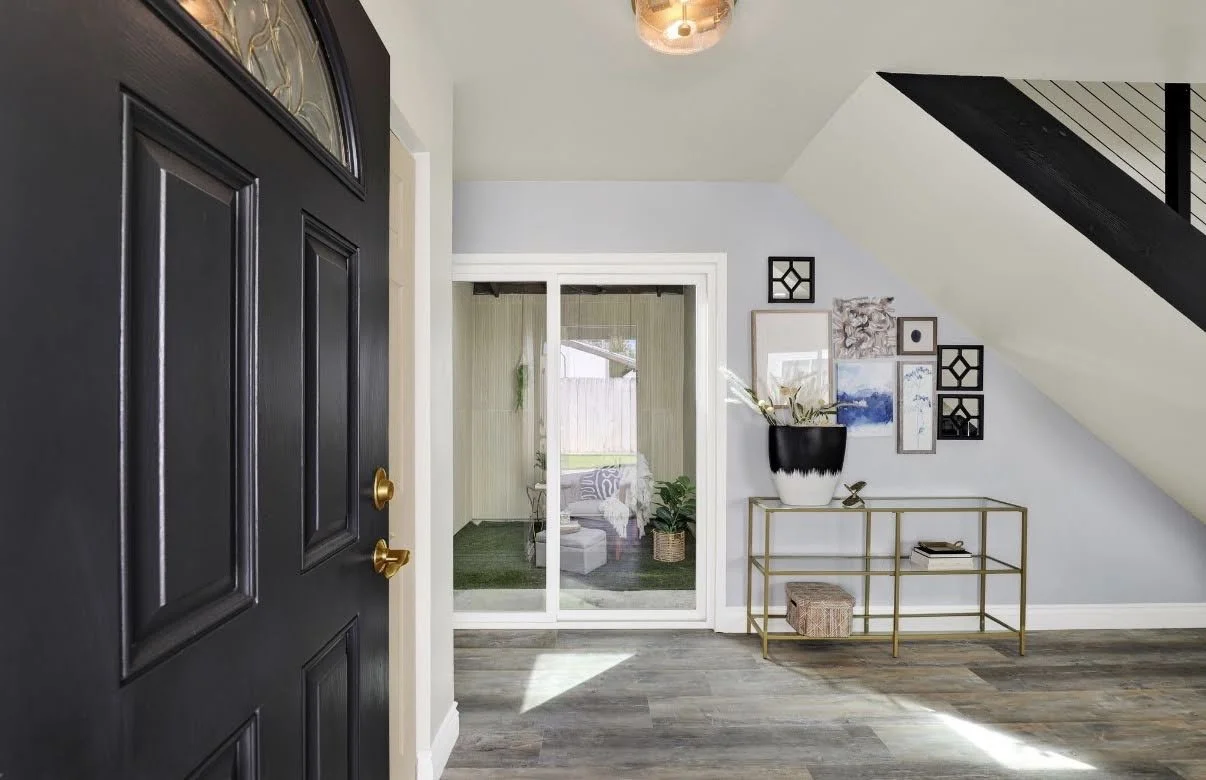
Awkward space? Challenge accepted. This Oceanside staging project had an unusual area beneath the staircase that needed a purpose. Rather than leaving it empty, we created a gallery wall with mixed artwork and sculptural accents above a sleek gold console. The result? An intentional, welcoming entryway that turns an architectural challenge into a design feature.
8. Let Your Gallery Wall Evolve
One of the things I love most about gallery walls is that they don’t have to be finished all at once.
In fact, some of the best collections evolve over years.
A photograph from a family vacation. A piece of artwork discovered at an estate sale. A handmade souvenir from a trip. A vintage mirror you couldn’t resist. These are the things that make a home feel layered and personal.
My own gallery wall still has a couple of spots where I want to add something. And I’m completely fine with that.
I’d rather wait until I find the right pieces than fill those spaces with something meaningless just to call the project finished. Your home doesn’t have to be finished to be beautiful.
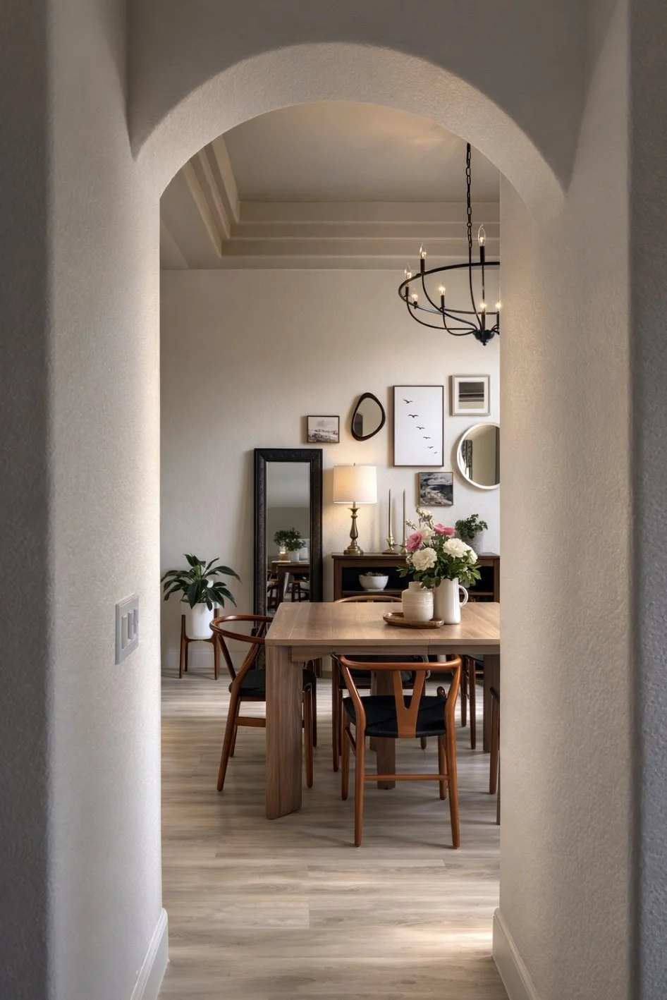
A little personality goes a long way. In this Oceanside interior design project, a gallery wall adds character and visual interest to the dining room while creating a beautiful focal point as you approach through the hallway. It’s a reminder that thoughtful artwork placement can make an impression before you even enter a room. Interior design by Haus of Heidi.
Your Walls Should Have Personality
Whether I’m creating a gallery wall for a design client, styling a vacant home for sale, or hanging family photographs in my own house, my approach is always the same.
Balance matters. Scale matters. And thoughtful placement matters.
But personality matters, too.
A beautifully designed space shouldn’t feel like it came straight out of a furniture catalog.
It should feel layered, welcoming, and intentional.
At Haus of Heidi, I believe good design isn’t about following every rule or chasing every trend.
It’s about creating spaces that feel like somewhere you’d actually want to be.
And sometimes, all it takes is a few thoughtfully arranged pieces on a wall to make that happen.
Because good design isn’t about impressing the neighbors. It’s about loving where you live.